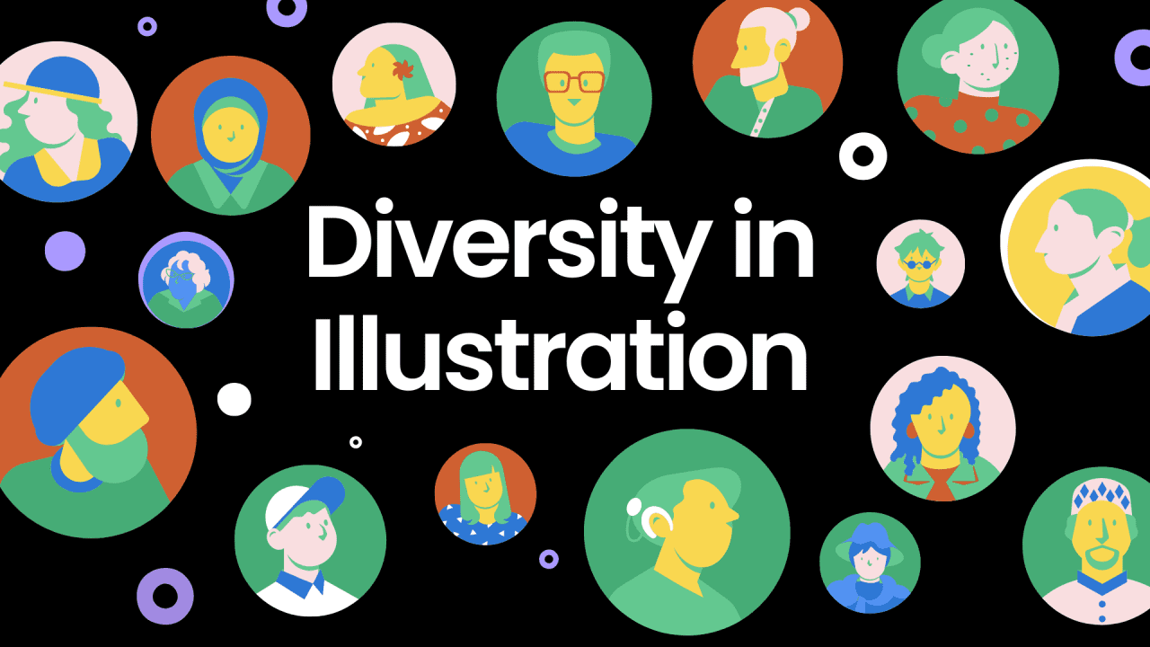
A guide to diversity in illustrations
You know that feeling when something just… gets you?
Like when a character in a video wears the exact brand of sneakers your uncle always wore, or the kitchen tiles remind you of your grandmother’s place?
That’s the power of thoughtful representation.
At Laundry Lane, whether we’re working in healthcare, government or with community orgs, we keep coming back to the same question: Who is here, and who is missing?
Here’s some of our learnings.
Representation doesn’t start on screen
What ends up in an animation is shaped long before production. It starts with the research, the tone of the brief, the casting, the visual style. If inclusion isn’t built into those early decisions, it risks feeling tacked on. That’s why we bring community in from the beginning.
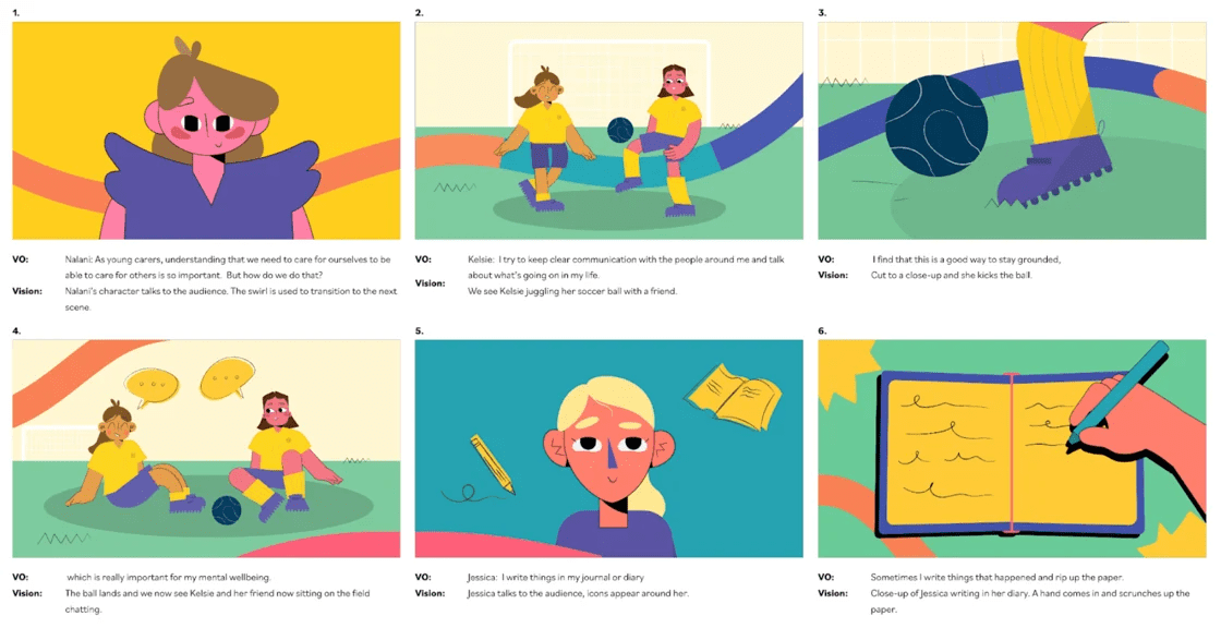
In our Young Carers animation, we invited carers across NSW to share how they support their mental health. Their words formed the script. Their photos guided the character designs. And we cast a mix of young and older voices to reflect their lived experiences — not just in look, but in sound and tone. We also adapted the visual world to feel child-friendly while still respectful. The result felt inclusive not because we aimed to “cover everyone,” but because we listened closely to someone.
Abstraction isn’t the only option
Faceless characters and neutral backdrops are often used to avoid exclusion, but when we strip away too much, we can risk losing the very things people connect with.
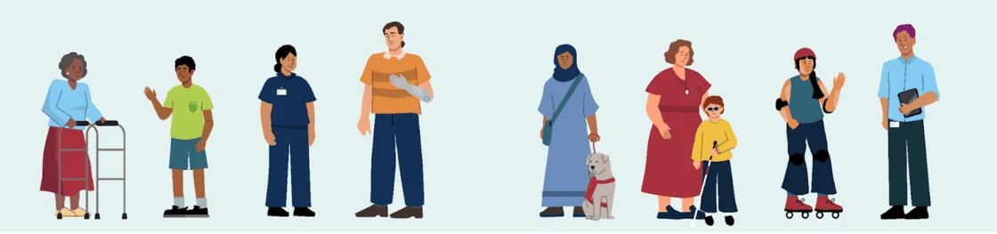
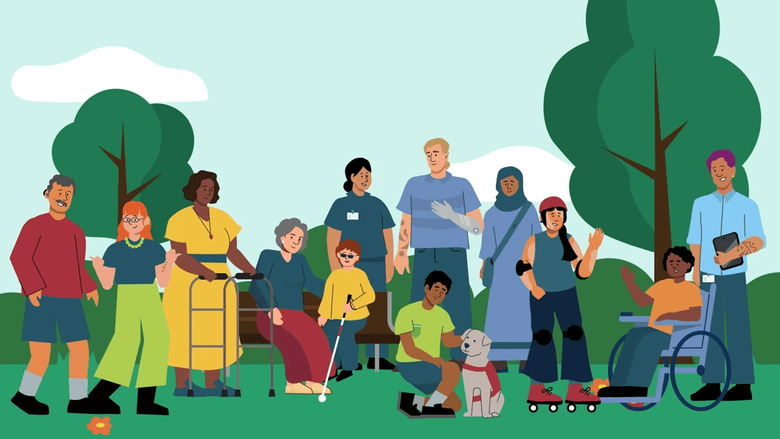
For a project with the Department of Social Services, we were asked to create a flexible suite of inclusive graphics. The characters needed to reflect diversity across disability (both visible and hidden), age, gender, and culture, all while aligning with the department’s colour palette and accessibility standards.
We collaborated closely with the client, balancing brand consistency with distinctive traits. We made sure characters weren’t just interchangeable templates, they had context, personality, and purpose. Feedback led to thoughtful changes, like adding a carer character and adapting cultural details.
Version One
Version Two
Familiar isn’t neutral
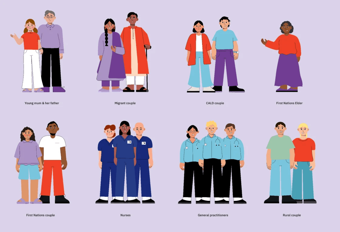
When you’re short on time, it’s easy to fall back on what feels familiar: the same office setups, the same family roles, the same faces leading the story. But familiar doesn’t mean inclusive. In our illustrations for Red Nose, the brief was to support bereavement care for First Nations, migrant, refugee and rural families. To make sure we didn’t impose assumptions, we co-designed the characters in consultation with community partners.
Through the co-design process we refined the character designs to better represent these communities, including changing things like character proportions, skin colour, and clothing to be more culturally appropriate. This approach ensured the characters were authentic and respectful, and fostered a stronger connection with both the healthcare professional audience and the communities they serve.
It’s not about showing everyone, it’s about centring someone
Inclusive storytelling doesn’t mean fitting every identity into every piece of content. It means choosing who to centre, and portraying them with depth and care.
That could mean reversing a pattern we’ve seen a hundred times by putting the teenager living with a disability at the heart of the story, letting the older person speak first, or showing a Muslim woman as a team leader, not a background extra.
It also means expanding how we show age. Not just as “elders” or “patients,” but as creatives, carers, decision-makers. These shifts might seem small, but they help your content feel more layered, more grounded and more real.