Here’s a bunch of campaigns we’re loving at the moment, and why they stood out to us.
From dismantling stigma with humour, to turning red benches into living memorials, reframing pee as a climate solution during the Super Bowl, and showing care through vignettes of a life well lived, these ideas show how many shapes good storytelling can take.
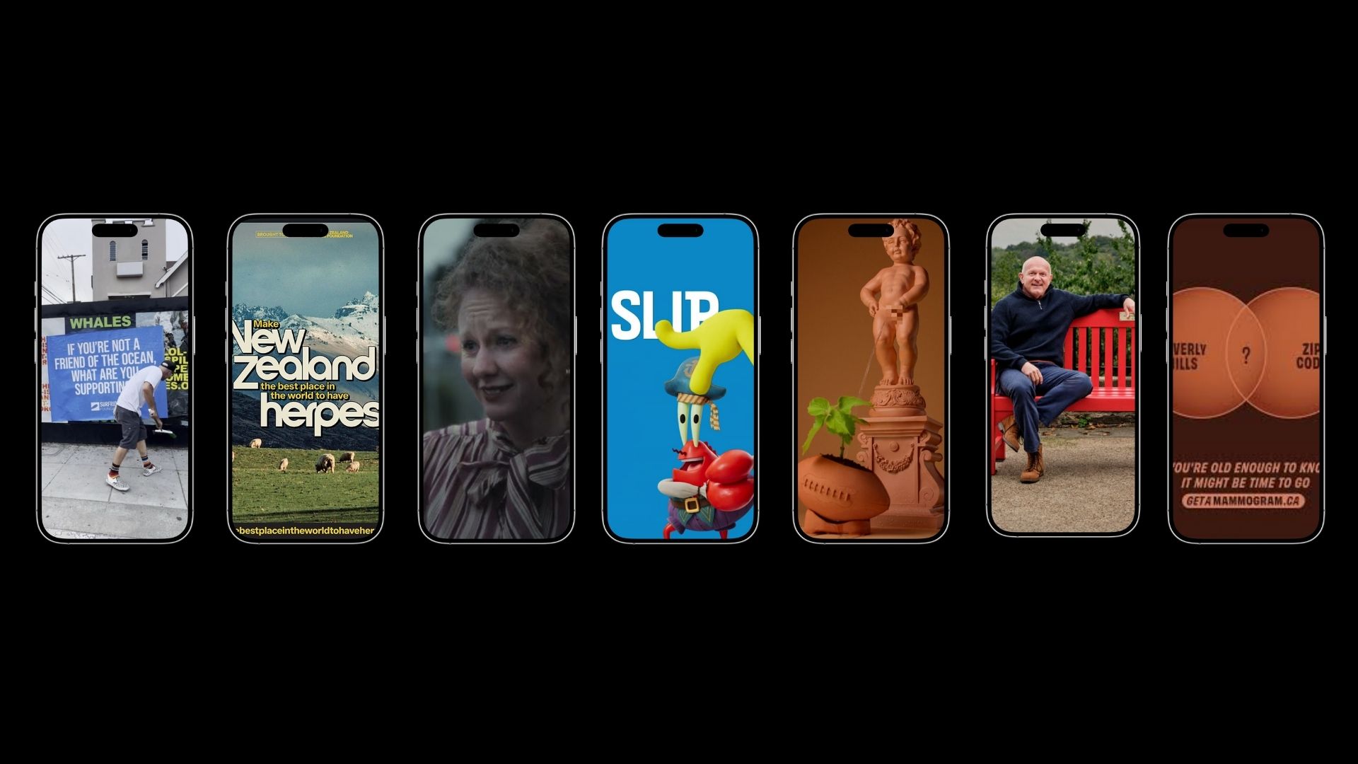
Make New Zealand The Best Place In The World To Have Herpes
One Powerful Place
Nature.Org Motion Film
We like this piece for its use of colour and texture. Deep greens, warm neutrals and ocean blues create a sense of balance between people and planet, while the organic textures give it a tactile, almost physical feel. The smooth transitions and rhythmic animation keep it engaging without overcomplicating things, and the clean typography gives the message space.
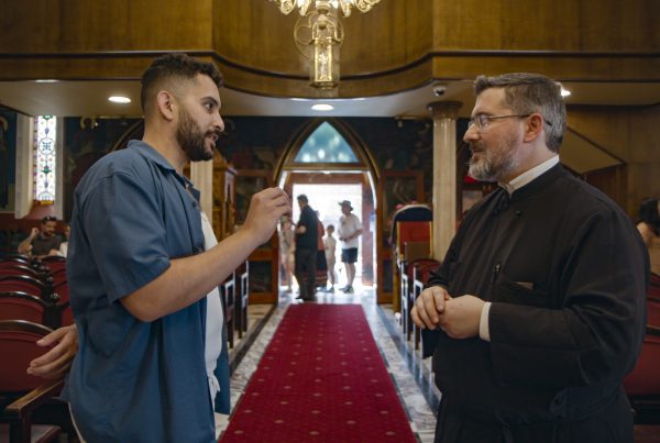
Gifting in Wills
We like this campaign from Salvation Army because it proves you don’t need a long timeline to make something meaningful. Creating a multi-era, character-led story in a single day takes craft. It feels focused and very human, which shows in the final film (plus we loved seeing familiar streets from the Inner West!)
A Dollars Journey
We like this piece for how clearly it translates a complex idea into something tangible. Following a single dollar gives the story a simple, trackable narrative, making impact feel real rather than abstract. The warm palette and subtle board game elements keep it optimistic without feeling naïve, while the mix of animation styles adds texture and movement without overcomplicating things. It’s a good example of how a strong central idea can carry both the storytelling and the design.
Where Hope Lives
SpongeBob for Sun Safety This Summer
We like this ad because a SpongeBob and Cancer Council NSW crossover was not on our bingo card for this year, but might be one of our favourite collaborations of late. What better way to get kids across slip, slop, slap, seek and slide than by having it come from the mouth of one of their favourite characters?
Pee On A Plant
Keep Us Breathing
We like this campaign because it turns storytelling into something you can literally stumble across. Sixty five real people, each with their own BHF red bench in their hometown, makes these stories feel part of everyday life, not tucked away in a feed.
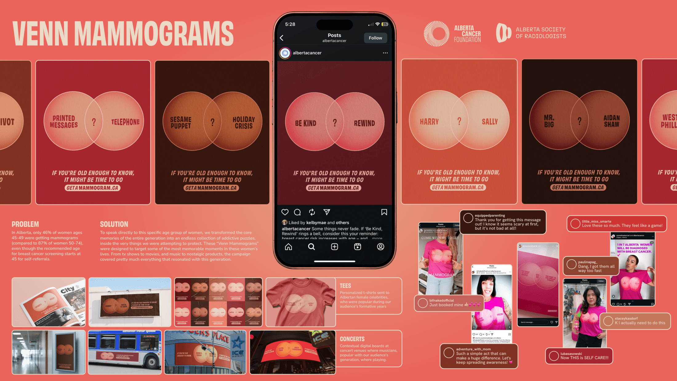
Venn Mammograms
We like this campaign because it sneaks an important health message into something unexpectedly fun. Turning core millennial memories into playful puzzles, right on the body part they’re meant to protect, is cheeky and clever. It makes early screening feel less intimidating and a lot more relatable.
The Poetry Of Landscape
We like this campaign because it lets the landscape speak for itself. Seeing the bush through a child’s eyes, paired with music so deeply connected to place, gives the story real depth and care.
Find A Higher Standard of Aged Care
We like this campaign because it reframes aged care as a relationship, not a service. Instead of focusing on tasks or logistics, it centres everyday moments, shared routines, small connections, and the trust that builds when care is done well.
If You’re Not A Friend Of The Ocean, What Are You Supporting?
We like this campaign because it doesn’t let you stay neutral (plus I have a soft spot for out-of-home ads). The language is bold and a little uncomfortable, calling out indifference and almost forcing you to pick a side.